Trevecca Athletics
Brand Refresh & Identity System
Brand Development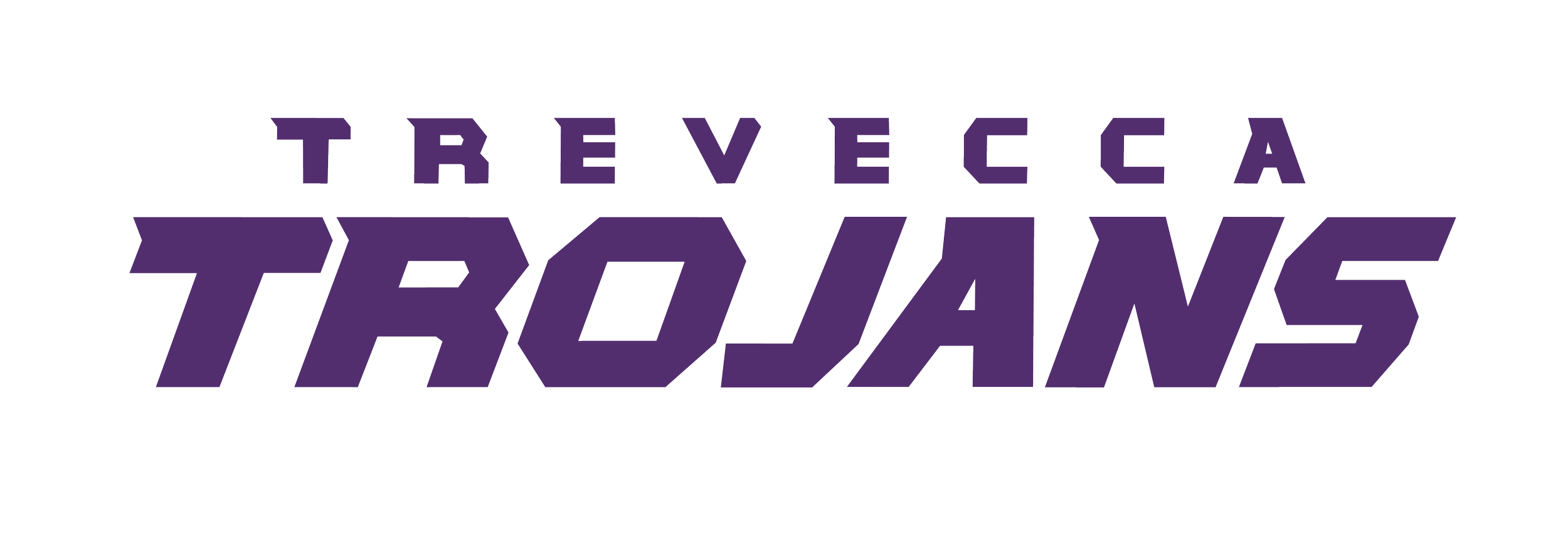
The Problem
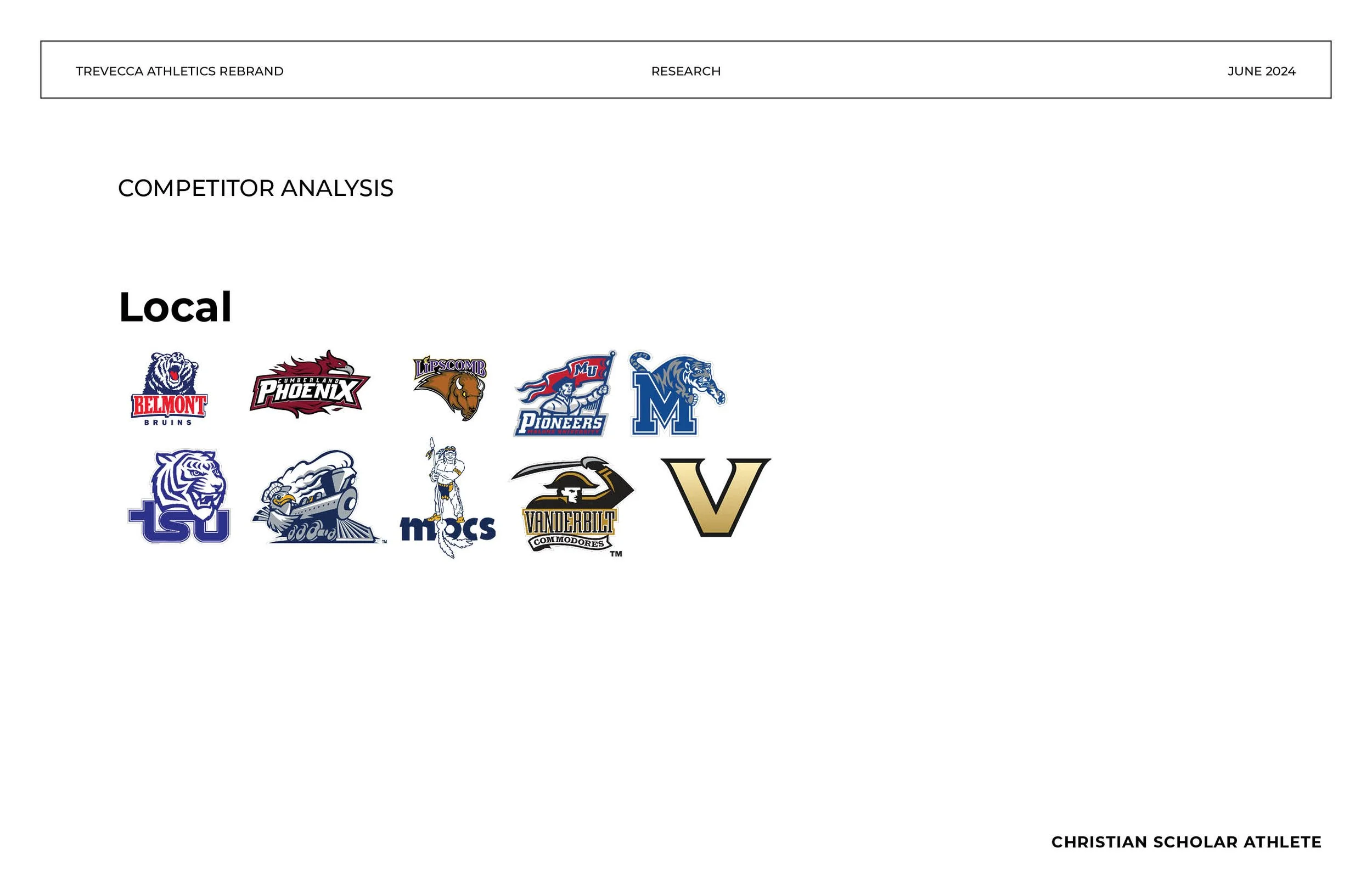
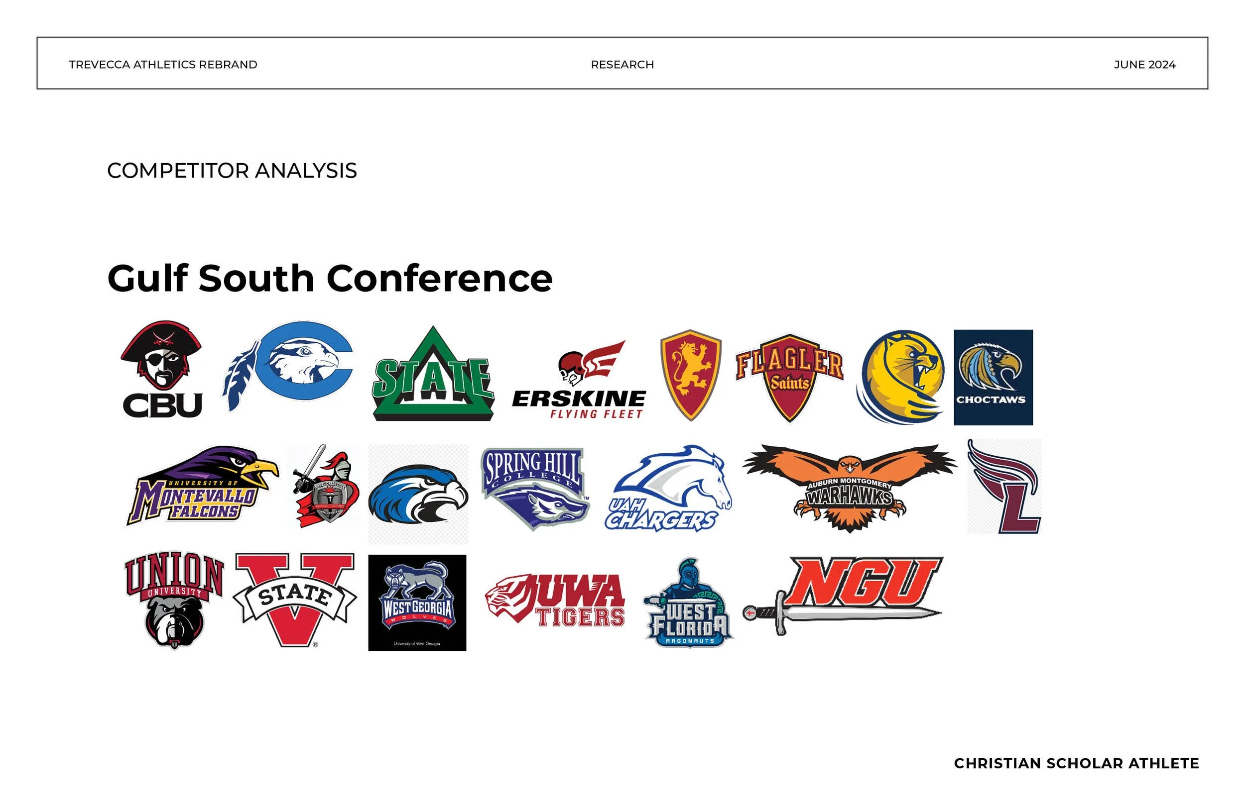
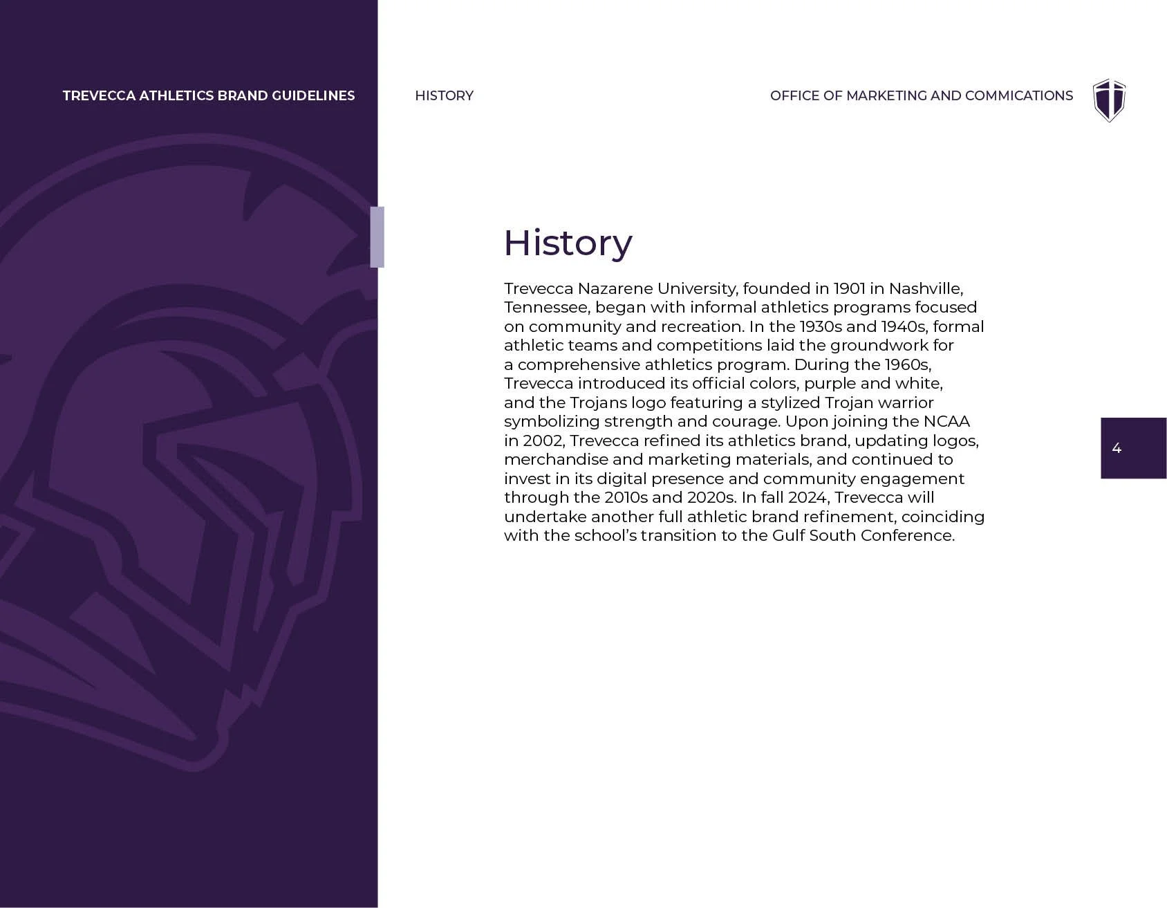
When Trevecca Nazarene University transitioned to a new athletic conference and entered a partnership with Nike, the timing forced a question that had been easy to push off due to budget and time constraints in the past but we could no longer ignore it; did the athletics identity represent a team that’s a real competitor?
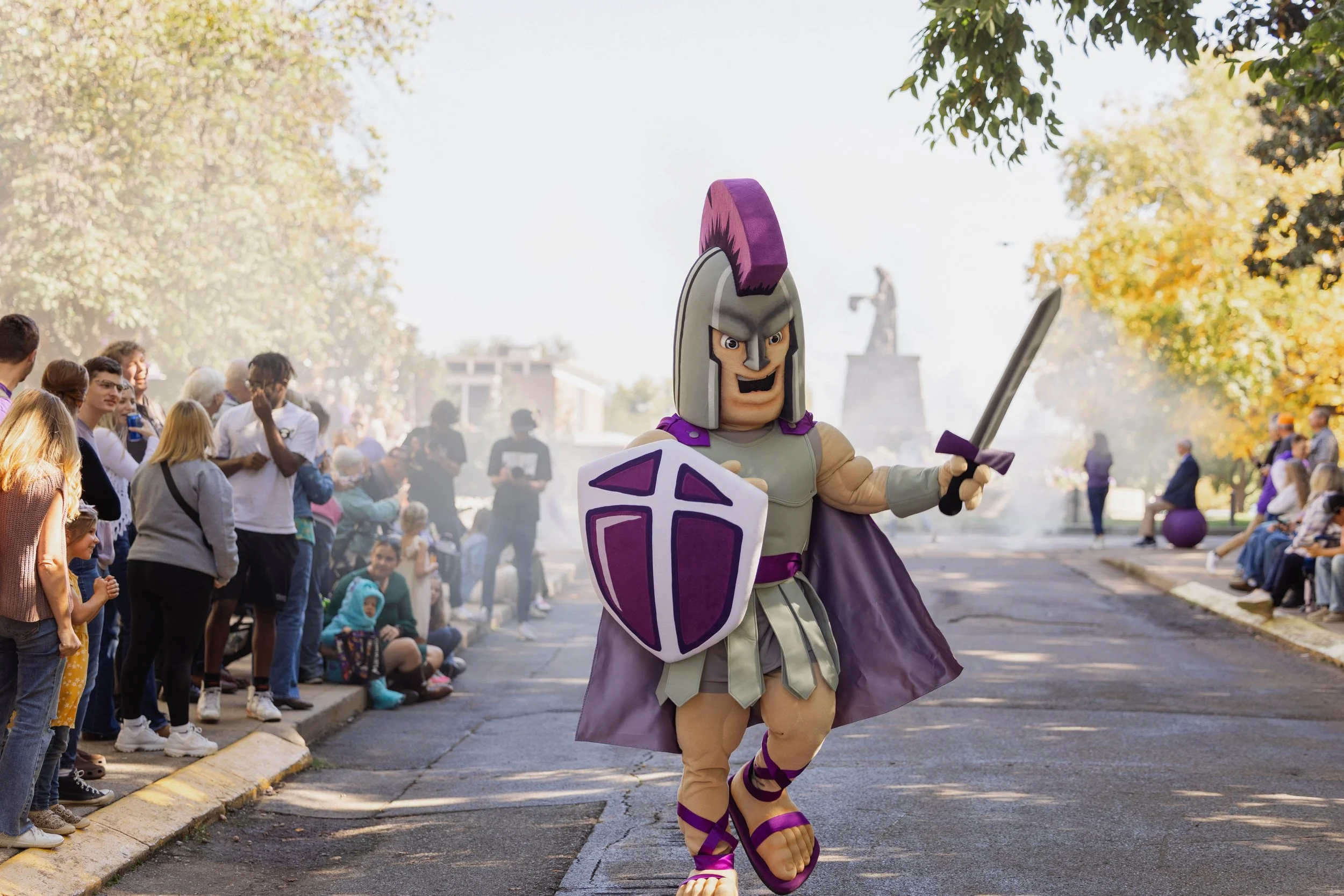
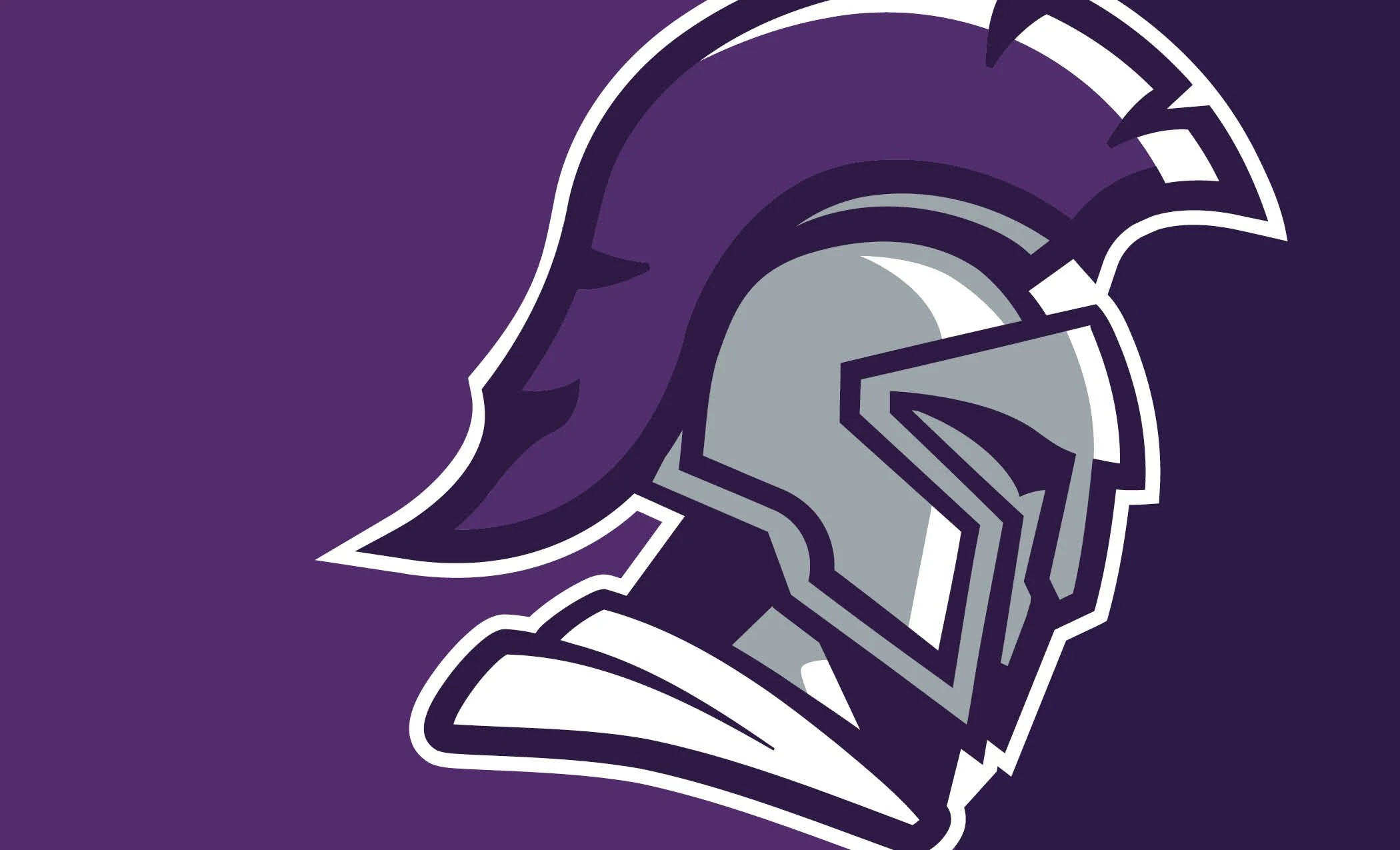
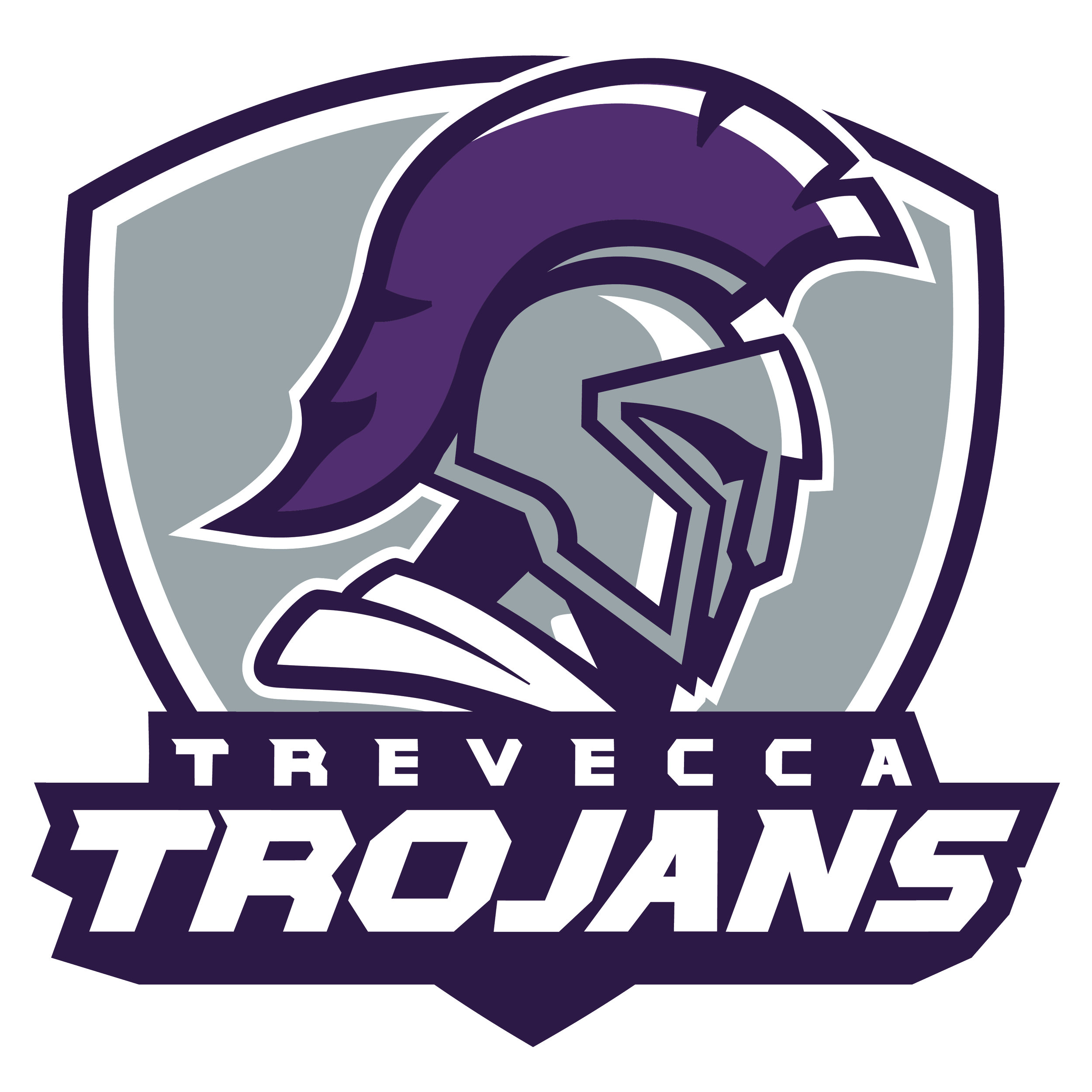
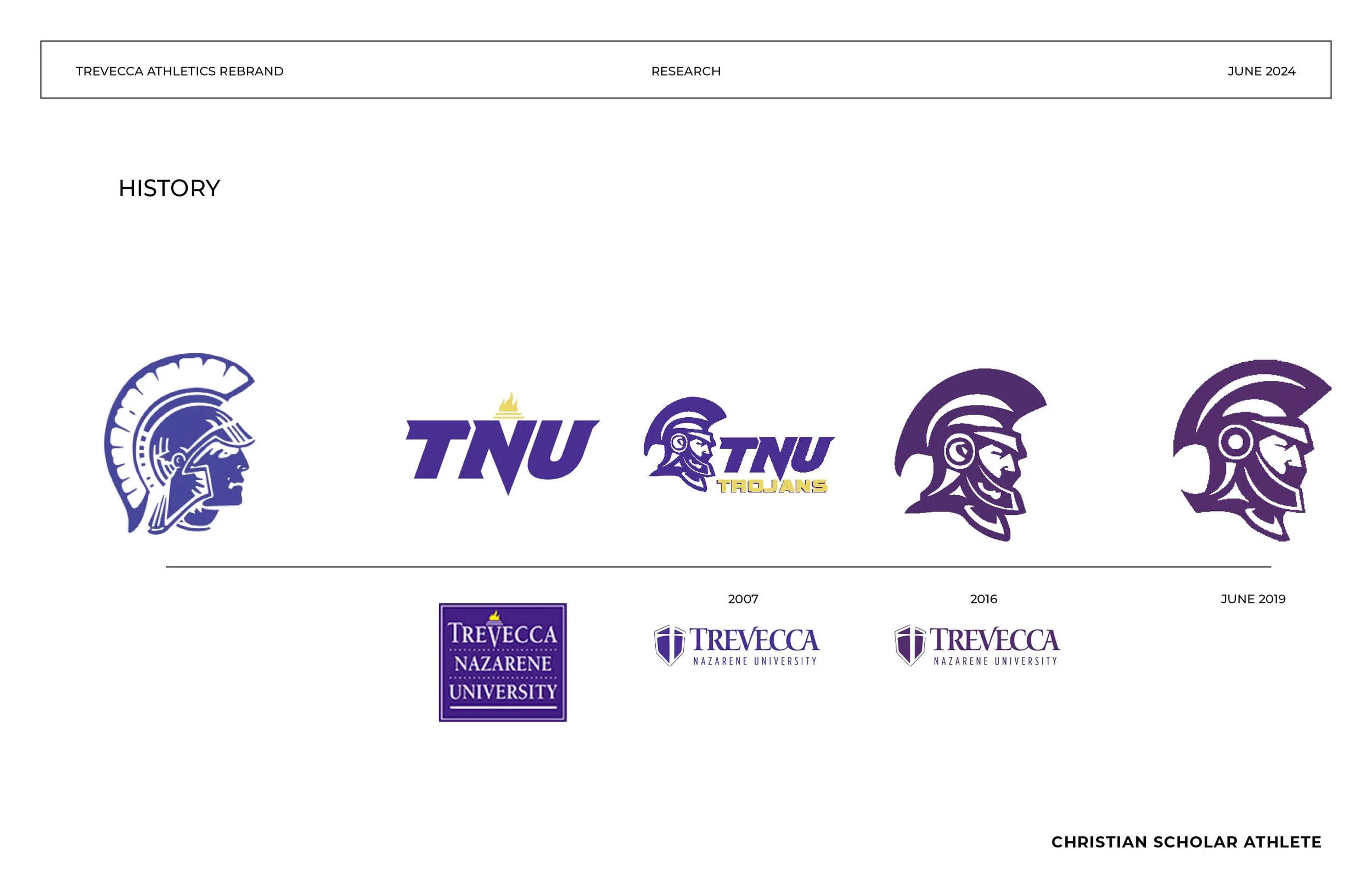
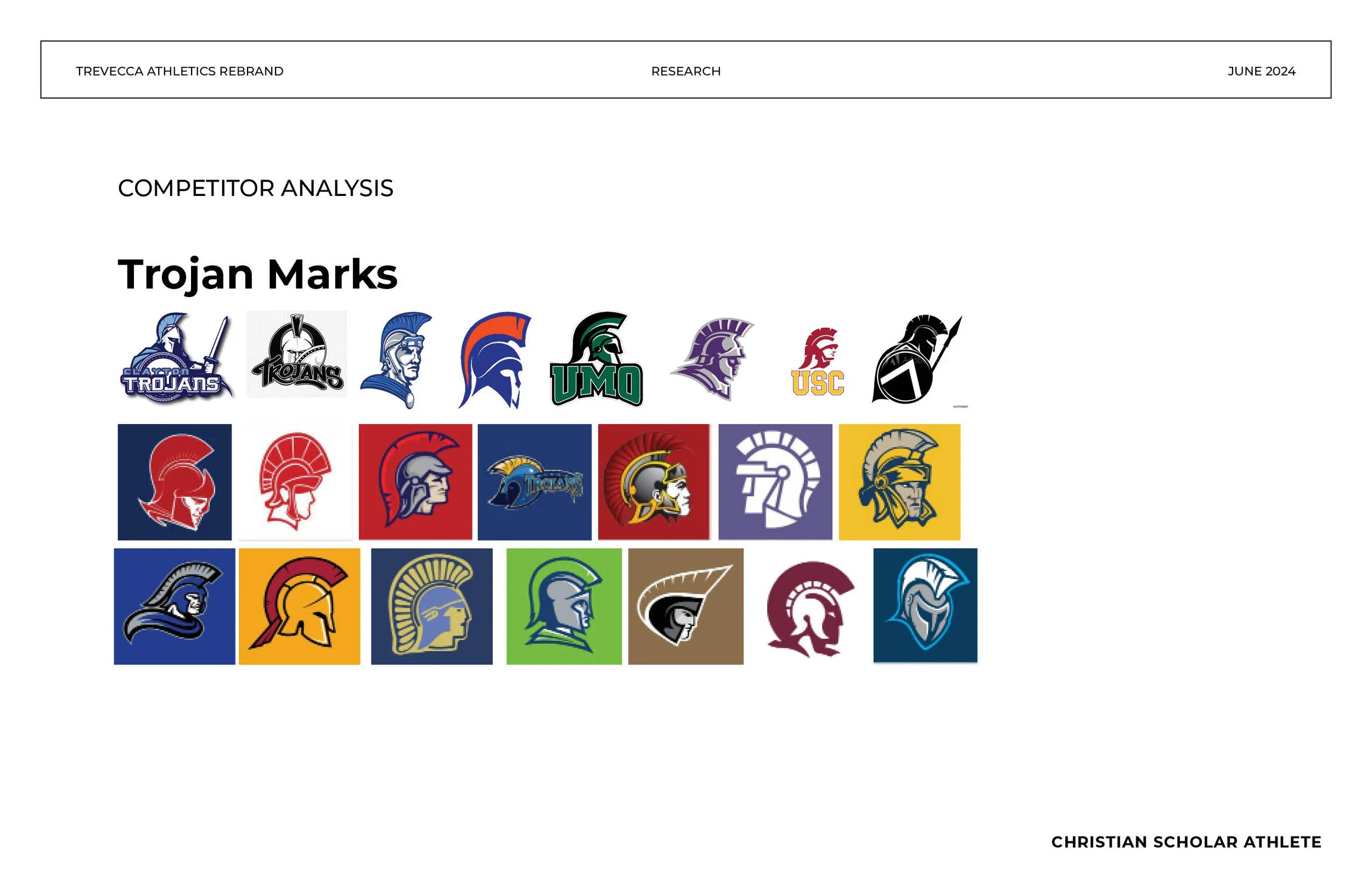
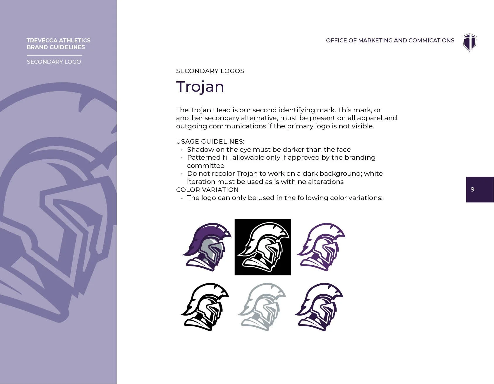
The mascot illustration was outdated, sleepy, and inaccurate to greek Trojan icons. Logo usage was inconsistent across sports, facilities, and merchandise with every team doing something slightly different with no system to govern it. A Nike partnership would ask for standards that had previously not been upheld and our brand needed to be worth pairing with a swoosh.
The Complication
Athletics rebrands at universities can come with politically charged pushback. We knew that we would have to start at the source and keep coaches and staff intimately involved throughout the whole process. We identifitied the loyalties of the old brand and the weaknesses in previous identity and addressed those areas first to create a lbrand identity that the entire Trevecca community could find pride in.

My Role
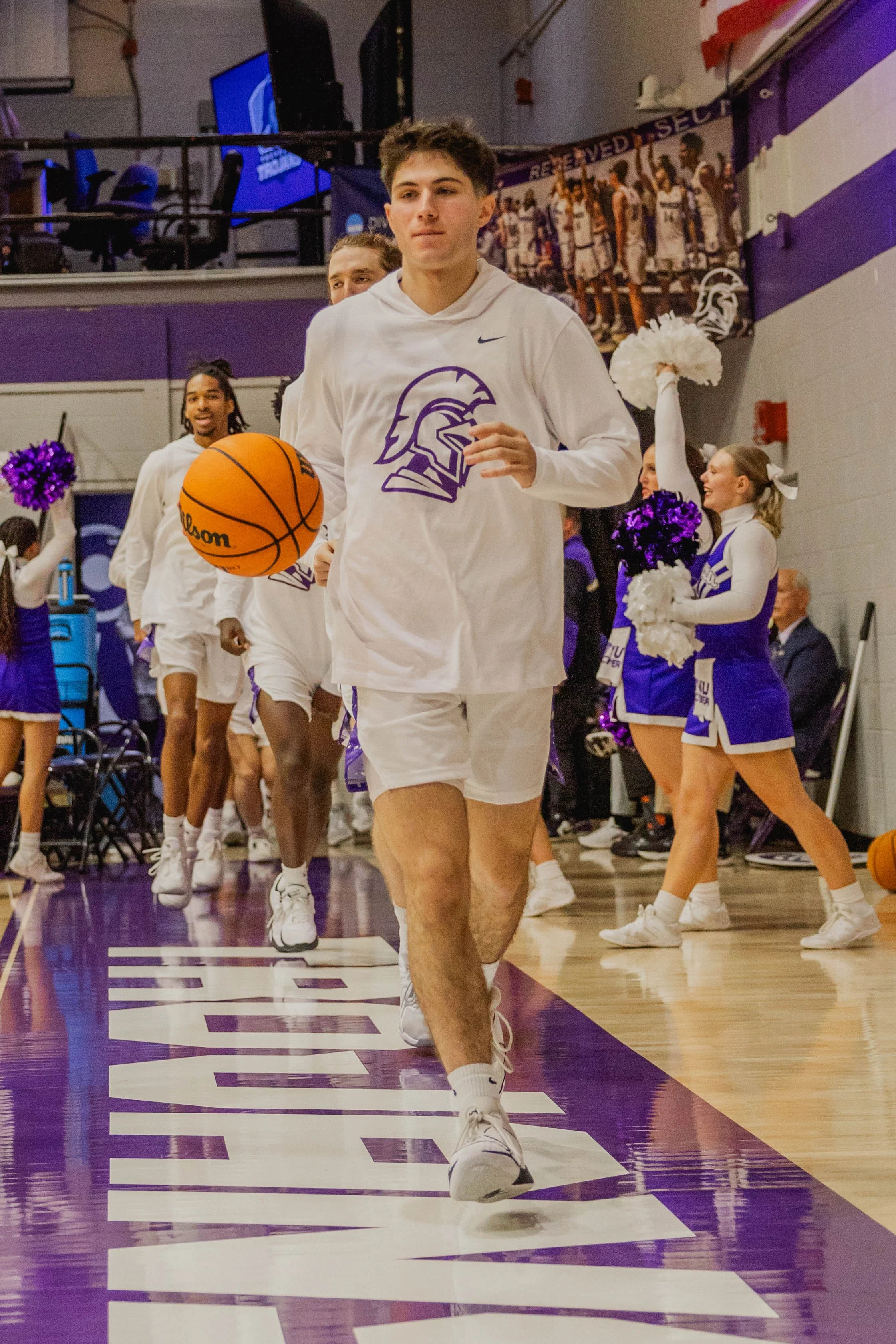
We kept the entire rebrand in-house from concept through delivery — identity system, custom typeface, submarks, and brand guidelines — keeping the entire project internal rather than outsourcing to an agency. That decision alone saved the university $50,000+ and kept hesitancy at bay with some of our most trusted coaches.
I structured the process around two formal presentation meetings with coaches and athletics staff, specifically to give stakeholders a voice before anything was finalized. Not as a formality but as a genuine creative input mechanism and to share in the relational excitement of a new athletics visual identity.
The Thinking
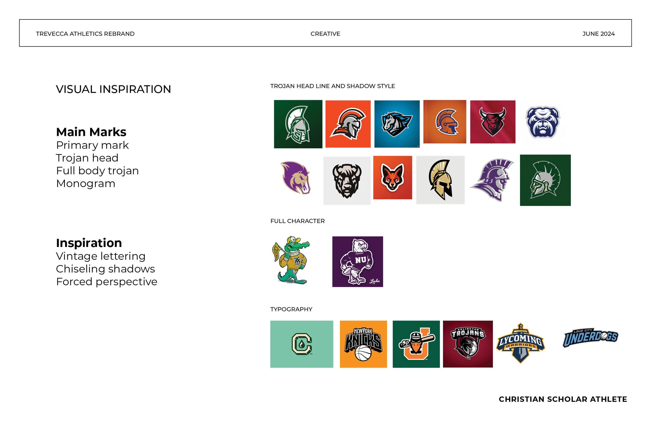
The visual problem was clarity and conviction. The old Trojan illustration was soft where it needed to be sharp. It didn't read at small sizes, didn't translate to merchandise, and didn't command the kind of presence a competitive athletics program needs on a scoreboard or a jersey.
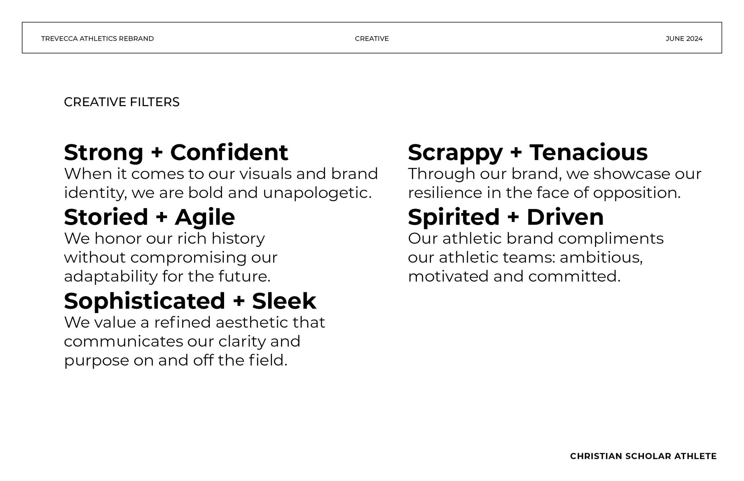
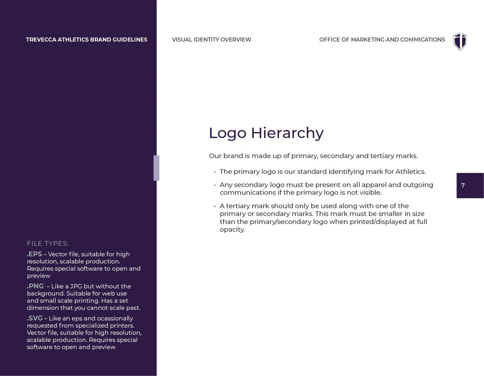
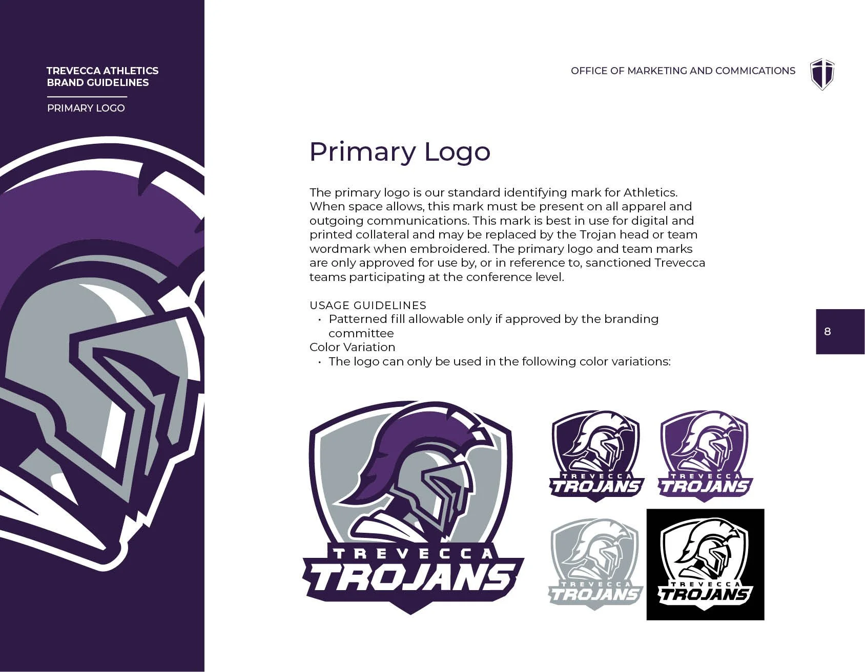
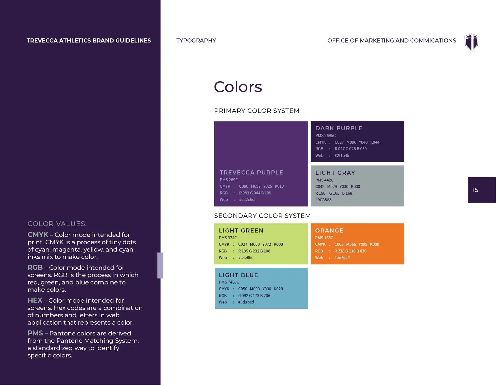
The new identity needed to be bold enough to satisfy coaches, systematic enough to satisfy Nike's partnership requirements, and coherent enough to sit alongside the university's broader brand without fighting it.
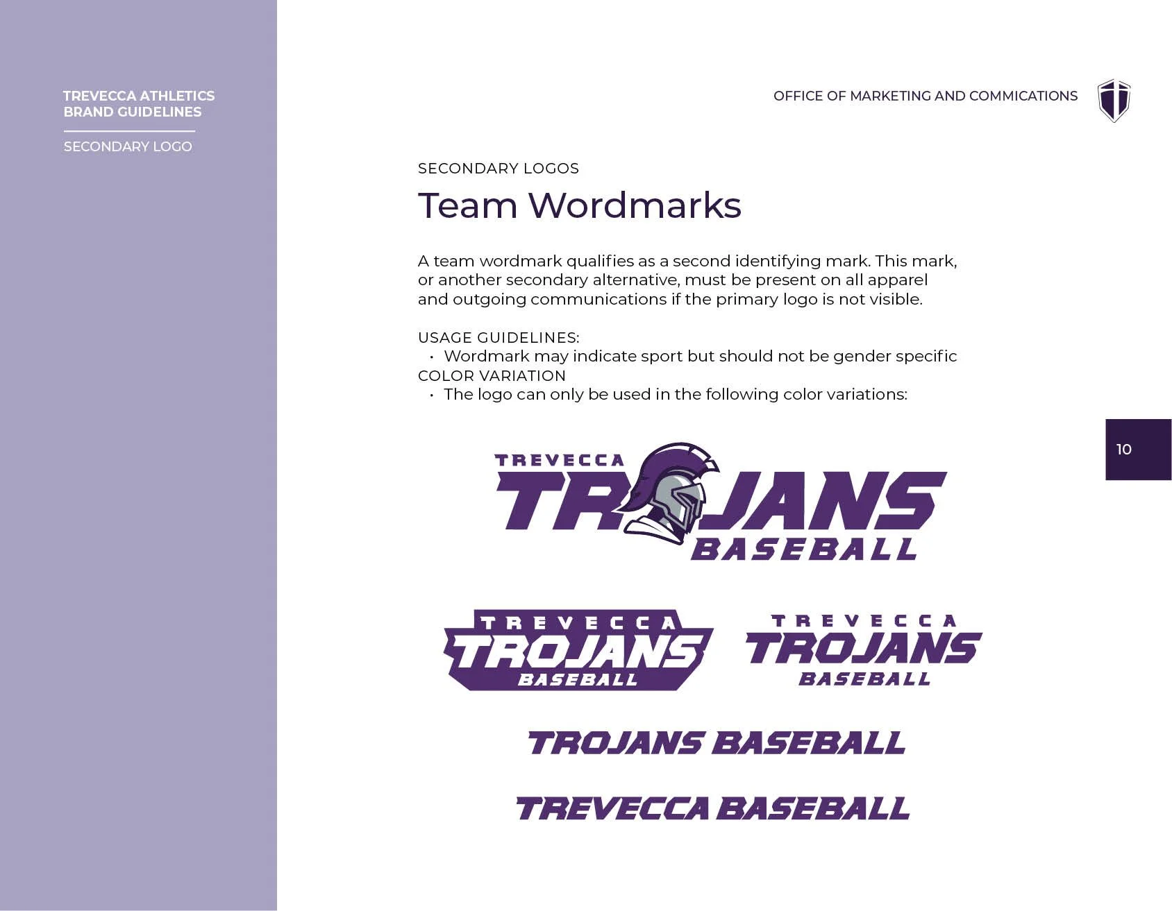
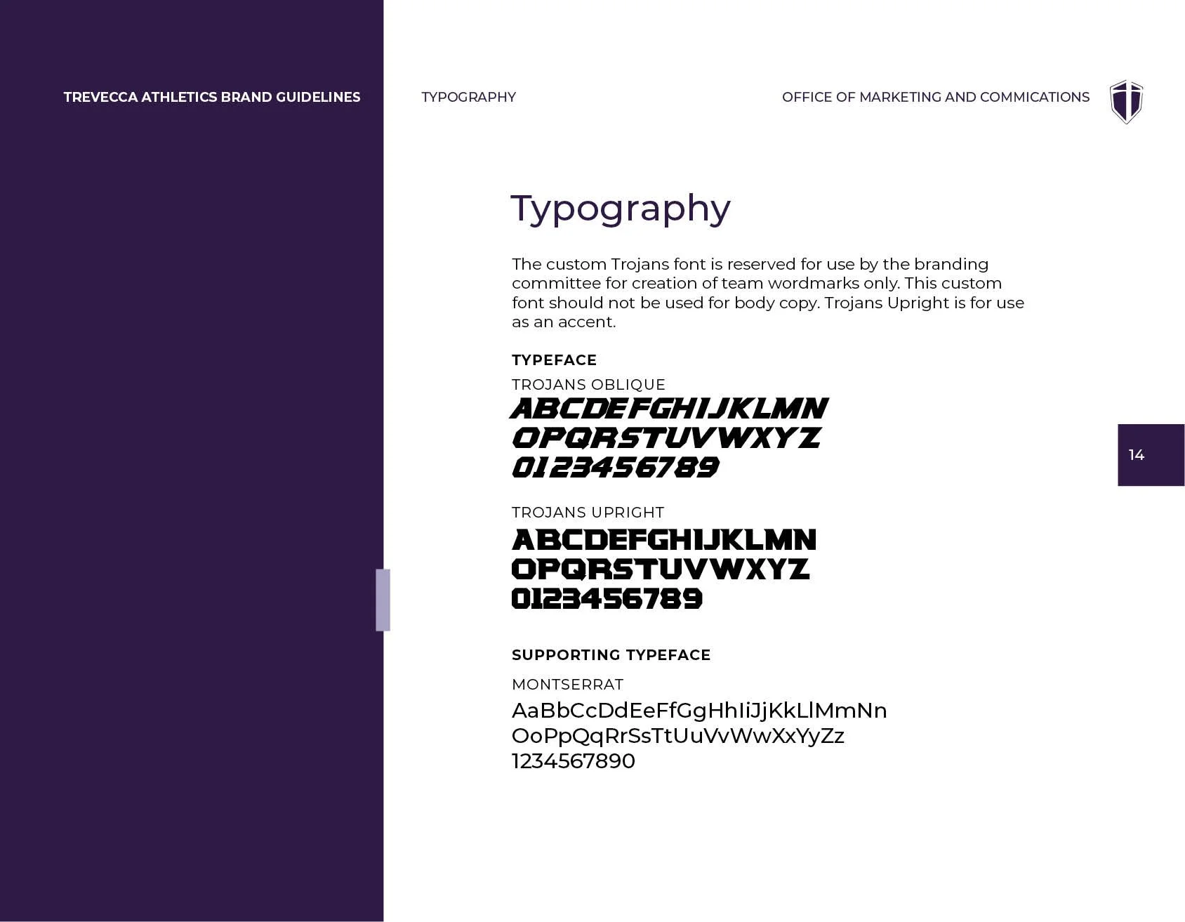
The custom typeface built off of an existing illustration alphabet from the old brand, but updated to add an edge and become two working font files; Trojans Oblique and Trojans Upright.
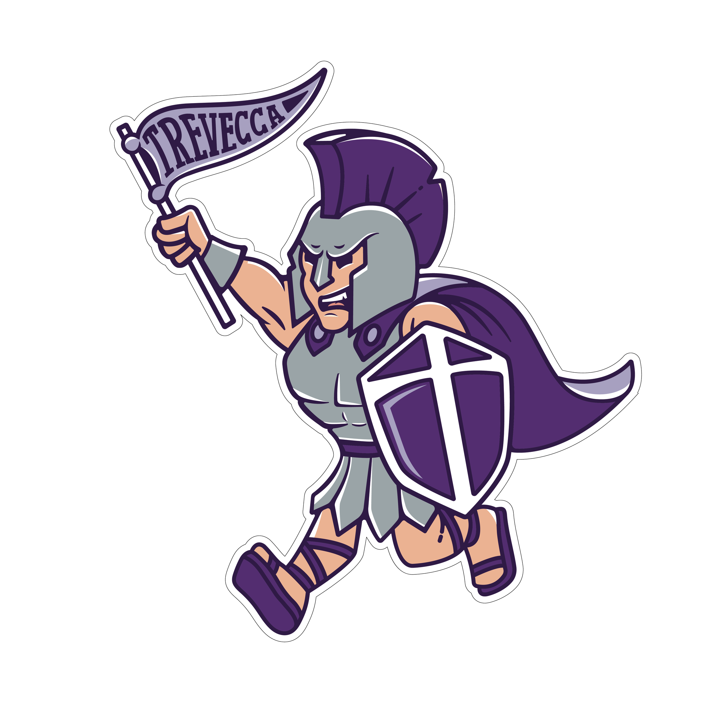
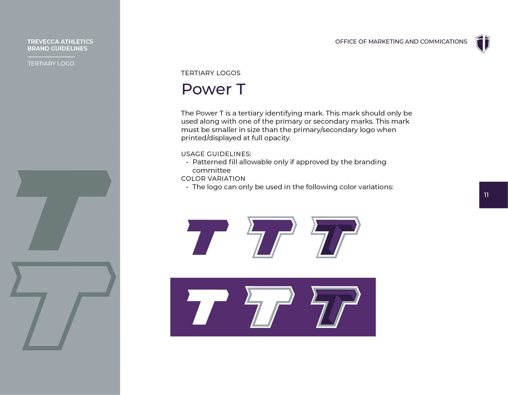
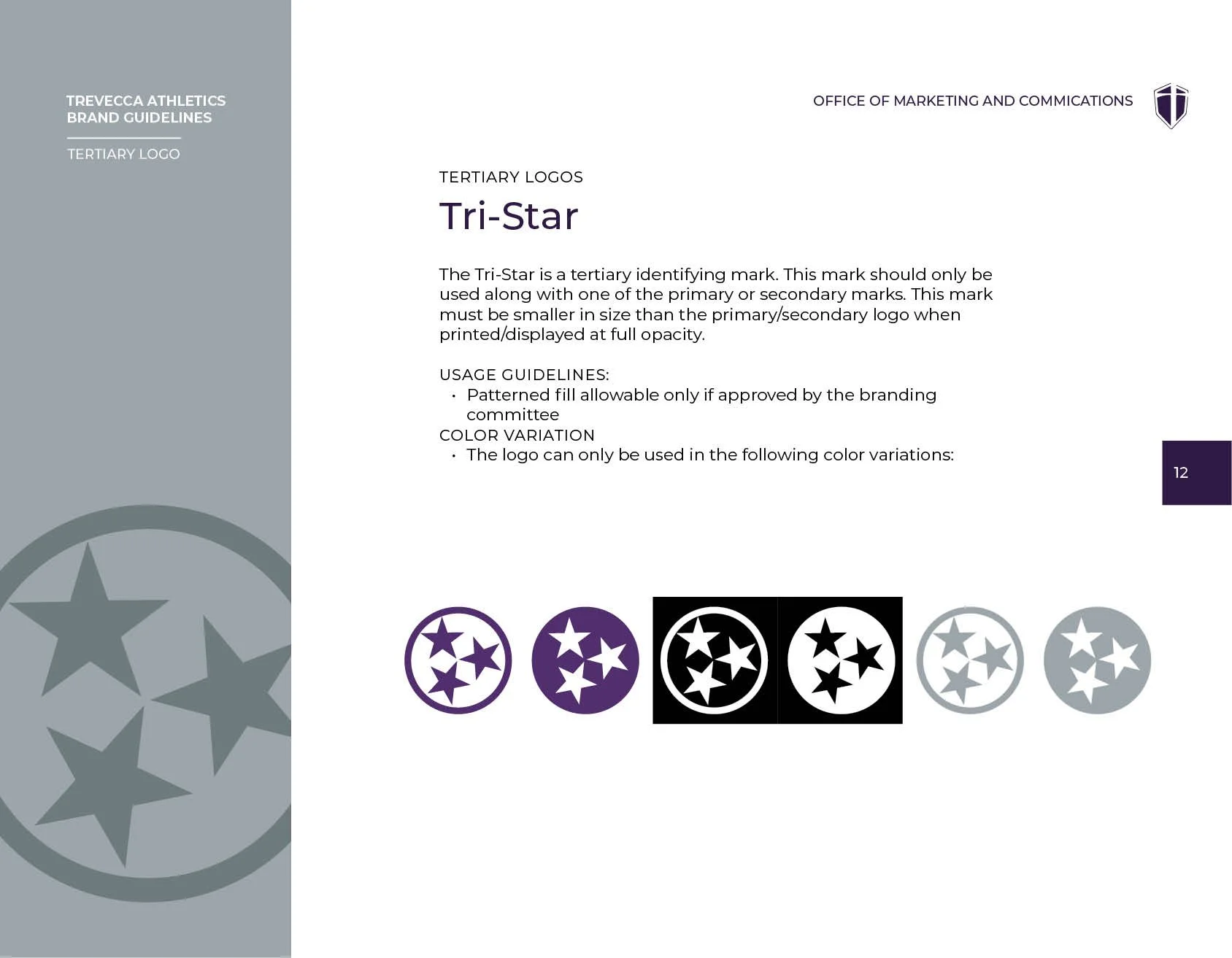
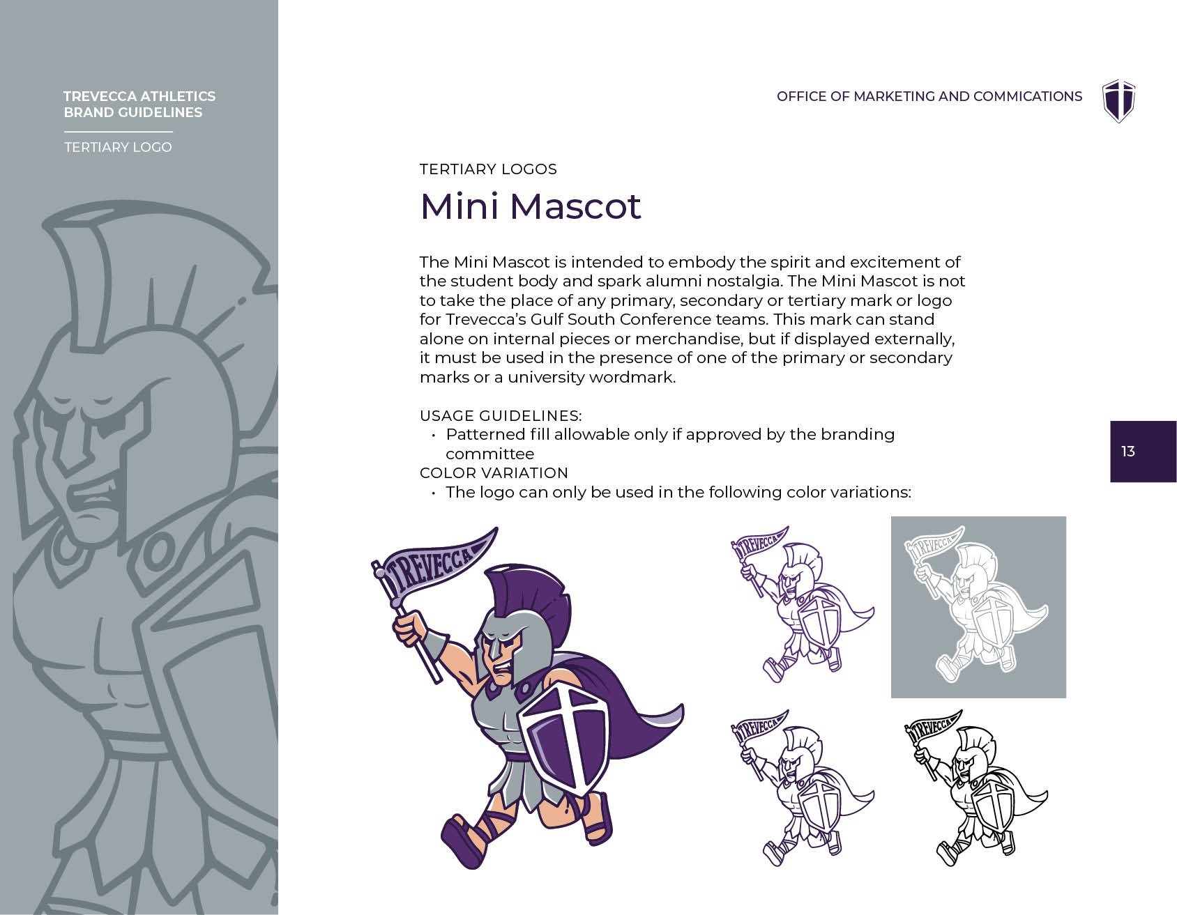
Finally, our addition of a tertiary family filled the gaps identified in the old guidelines, the mini mascot being our opportunity to allow the student body to have a mark that represents them, whether they’re on the court or off of it.
The WorkThe Work
The visual problem was clarity and conviction. The old Trojan illustration was soft where it needed to be sharp. It didn't read at small sizes, didn't translate to merchandise, and didn't command the kind of presence a competitive athletics program needs on a scoreboard or a jersey.
The new identity needed to be bold enough to satisfy coaches, systematic enough to satisfy Nike's partnership requirements, and coherent enough to sit alongside the university's broader brand without fighting it.
The custom typeface built off of an existing illustration alphabet from the old brand, but updated to add an edge and become two working font files; Trojans Oblique and Trojans Upright.
Finally, our addition of a tertiary family filled the gaps identified in the old guidelines, the mini mascot being our opportunity to allow the student body to have a mark that represents them, whether they’re on the court or off of it.
Results
The new athletics identity launched with full buy-in from coaches, staff, and community. It met Nike partnership standards, gave every sport a consistent system to work from, and brought the Trojans identity in line with the university's broader brand evolution.